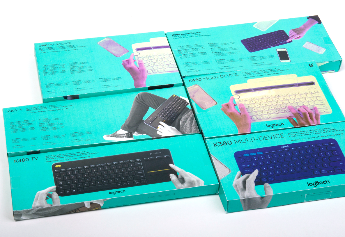
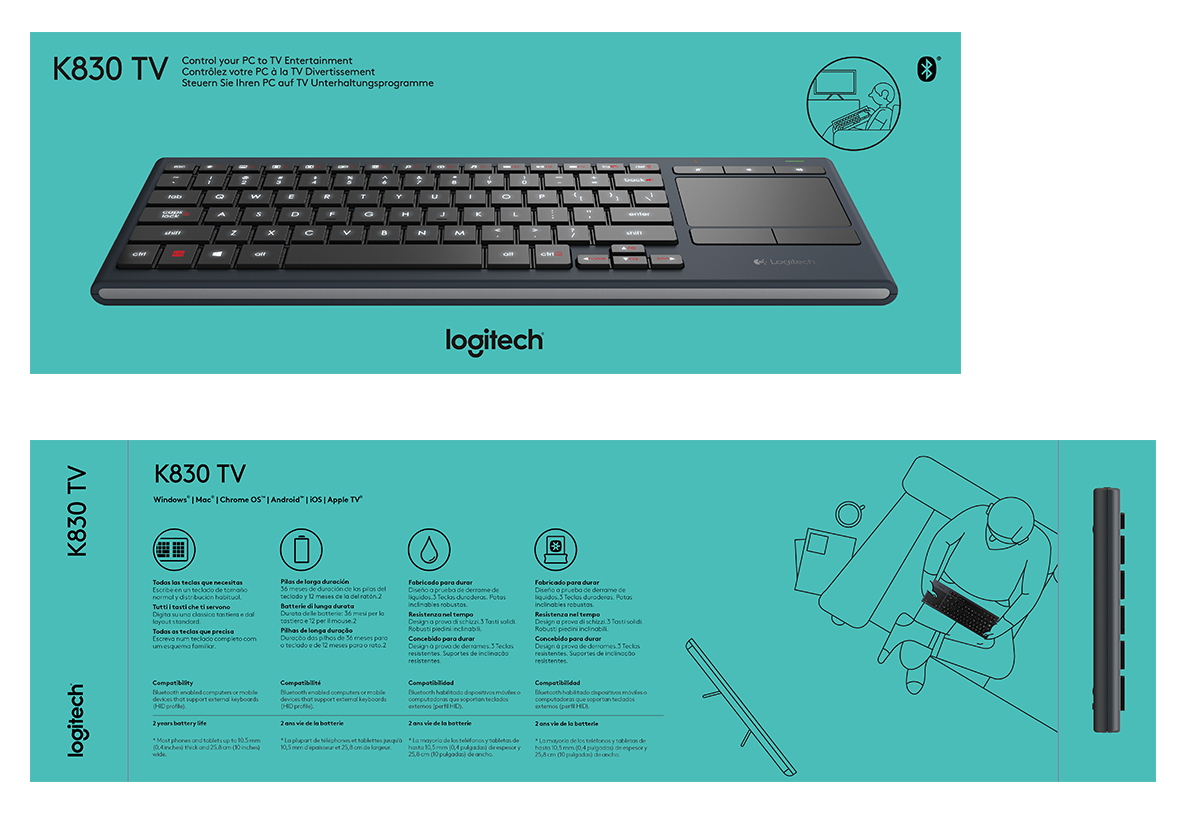
Logitech Keyboard Packaging
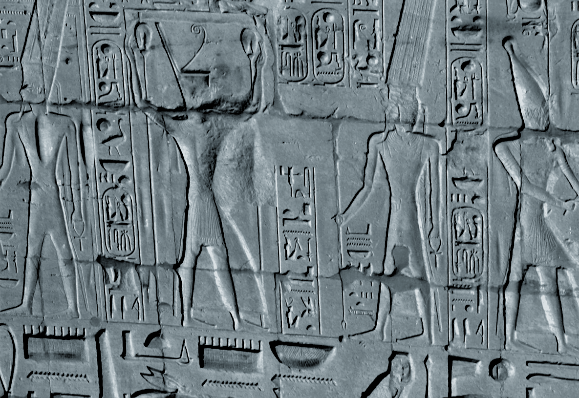
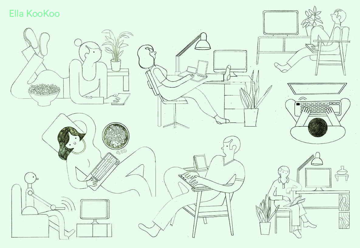
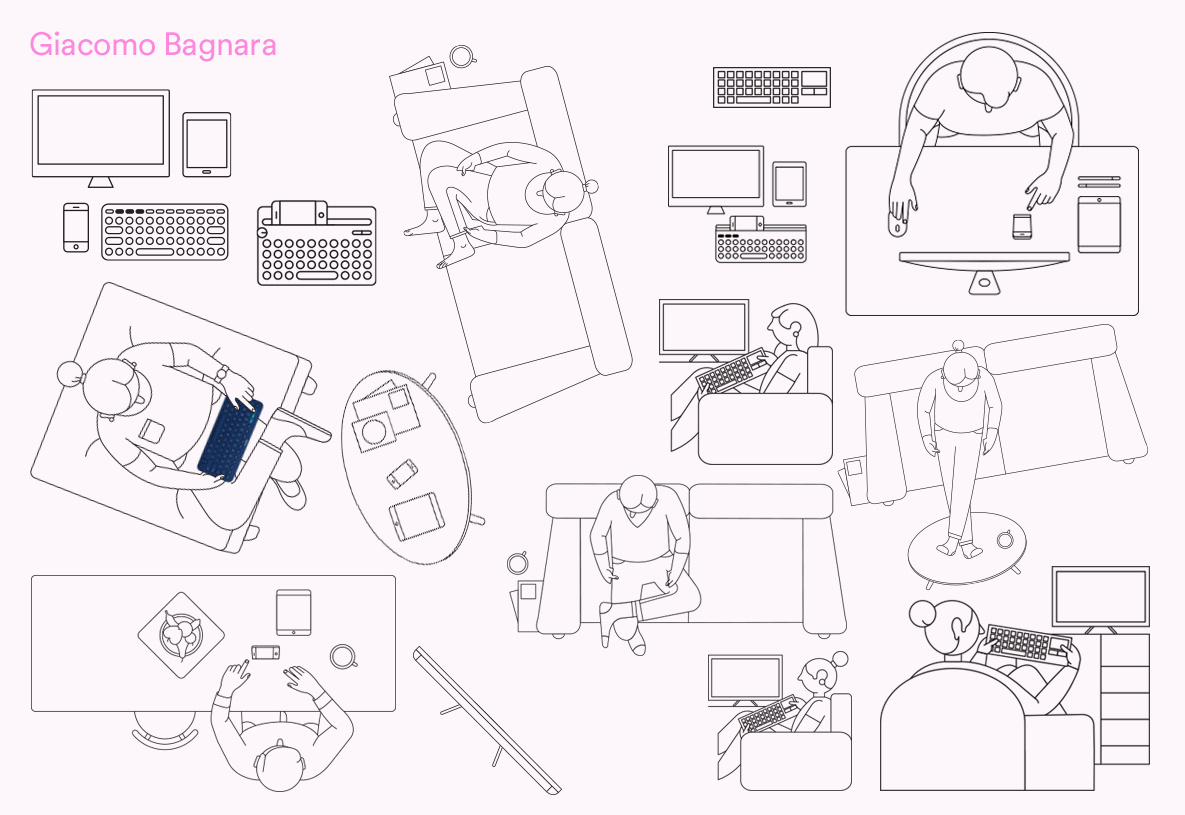
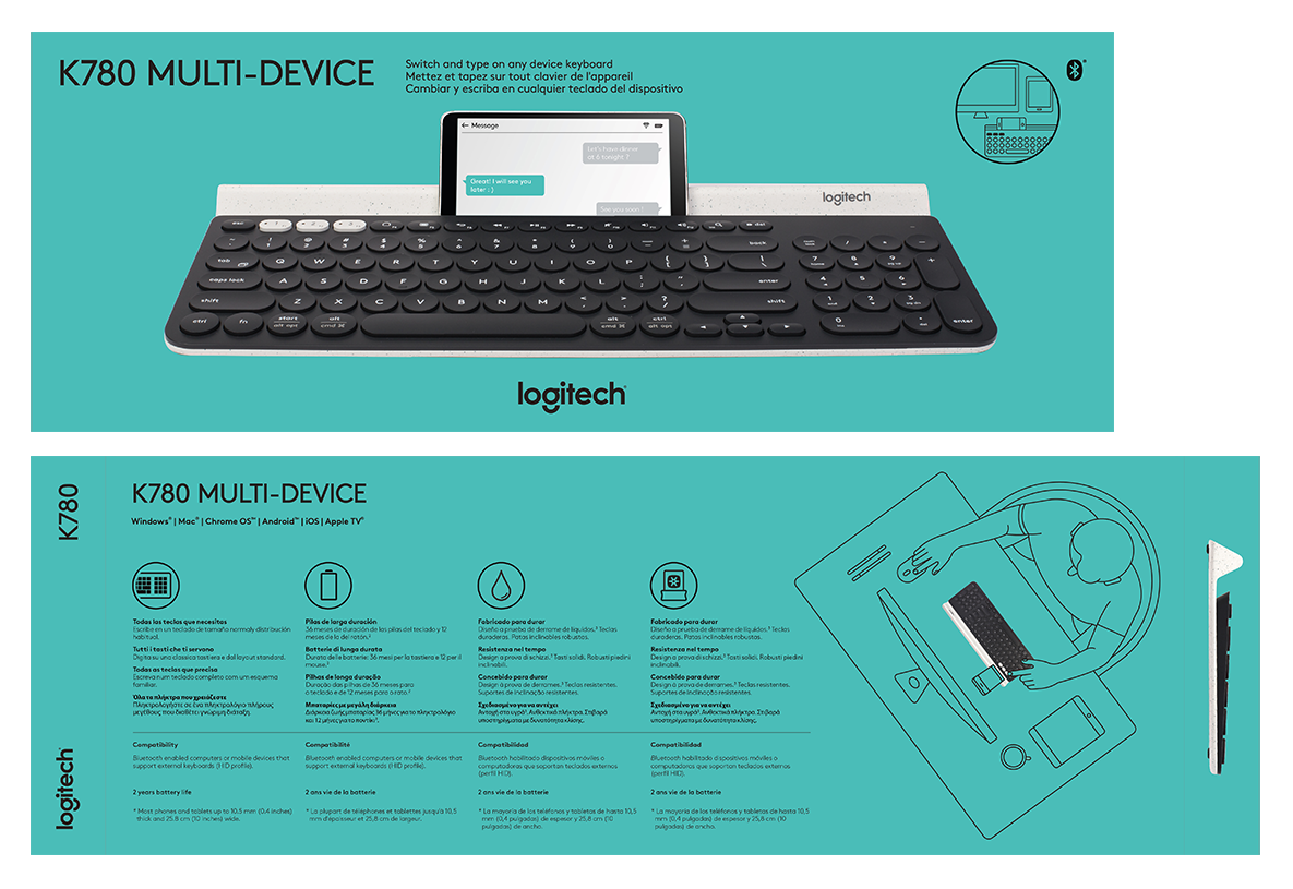
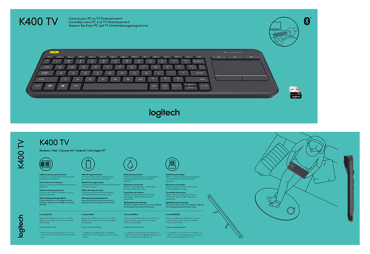
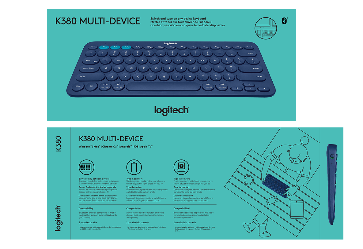
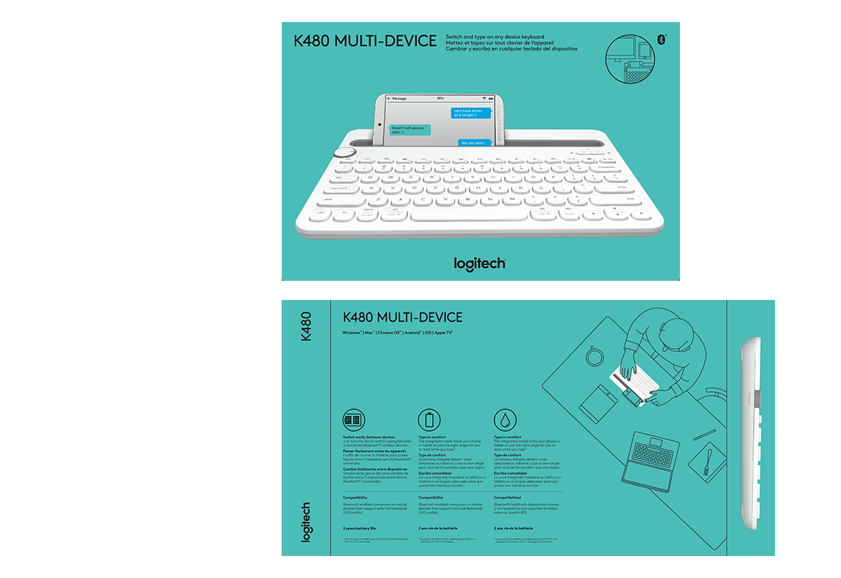
One of the challenges for the keyboard business team was to have a way for consumers to quickly differentiate between keyboard types. It became clear that listing features (and their translations) had become increasingly complex and confusing. Inspired by Karnak Temple Complex, I proposed using modern illustrations to communicate the usage of the keyboard. Similar to how hieroglyphics depict the everyday use of tools such as the abacus by different professionals, the idea was to use illustration to convey the settings and context where the keyboard was useful. I worked with two amazing illustrators, Ella and Giacomo to conceptualize the illustration style.
Role: Art direction, visual design, brand strategy, and creative direction.
BACK TO INTRO
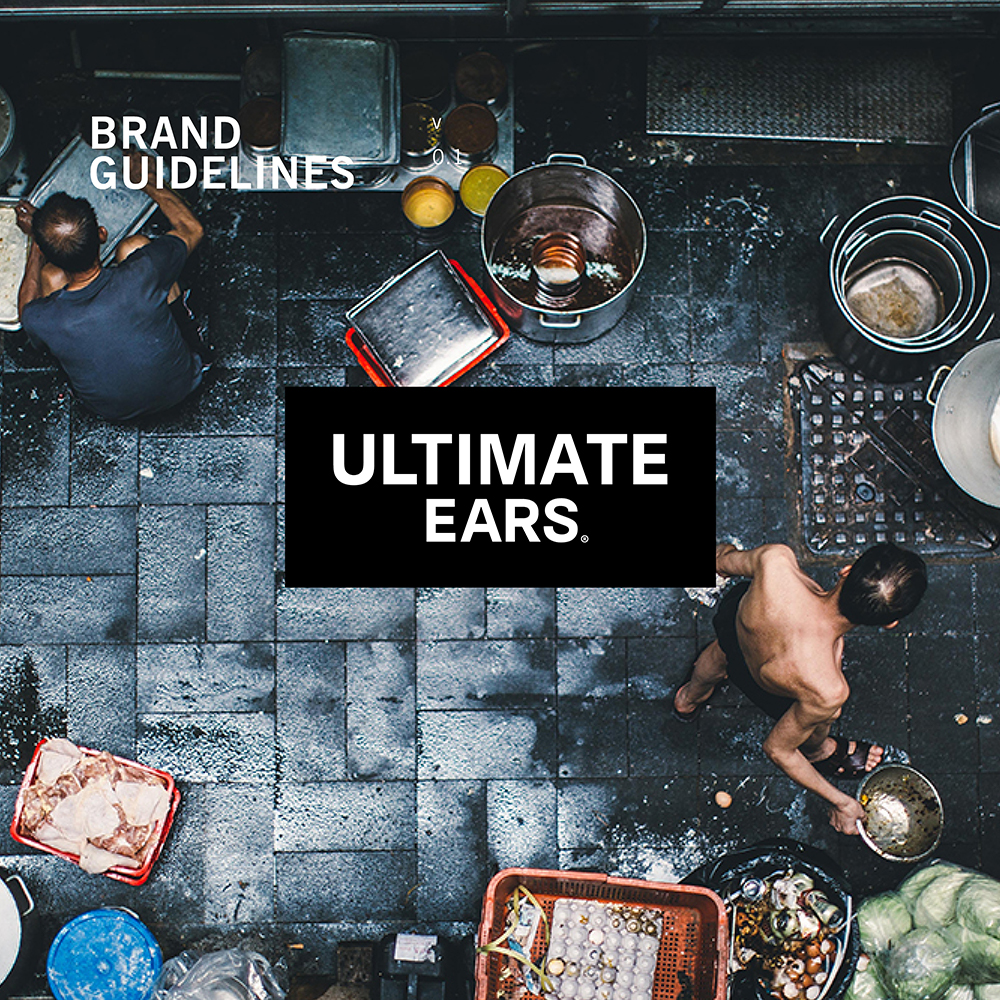 Ultimate Ears Rebrand
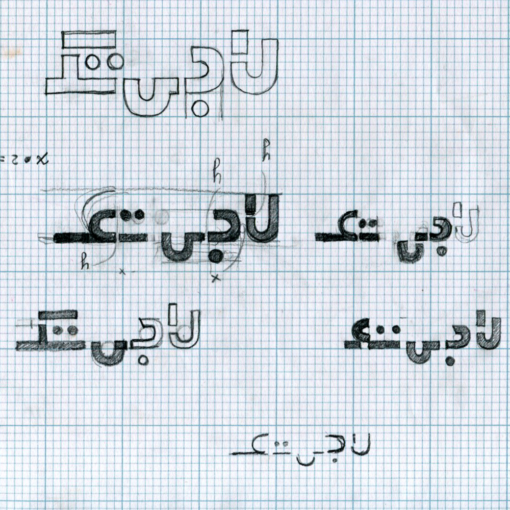 Logitech in Farsi
 Harmony Remotes Rebrand
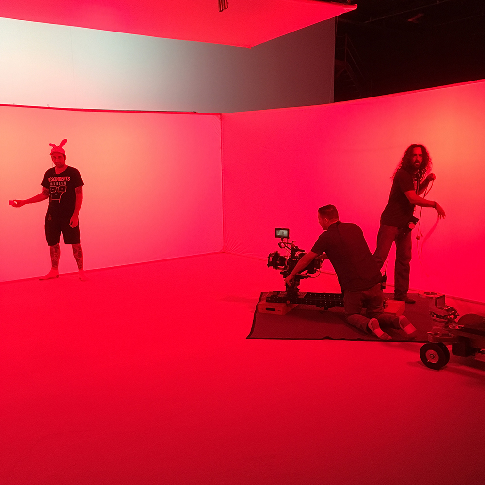 POP Smart Button
 Spotlight Commercial
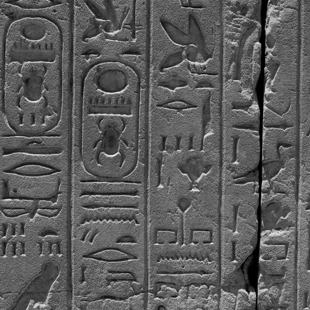 Keyboard Packaging
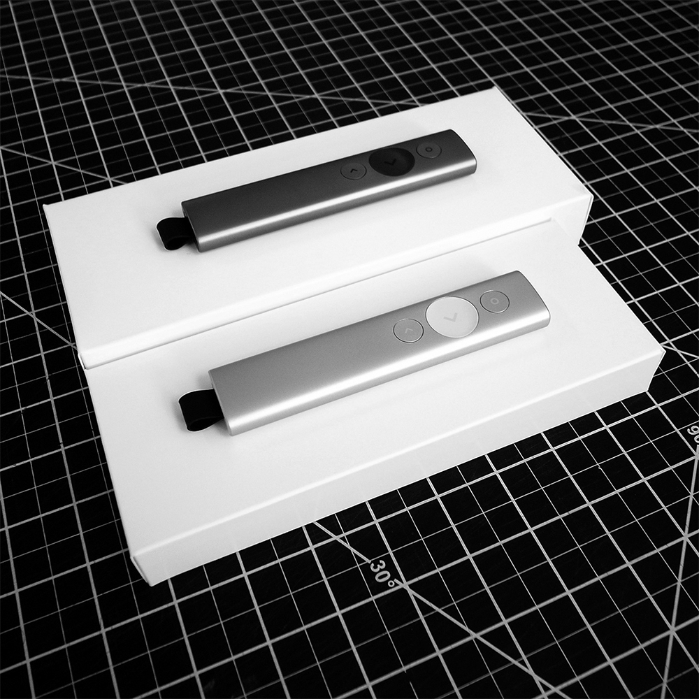 Spotlight Packaging
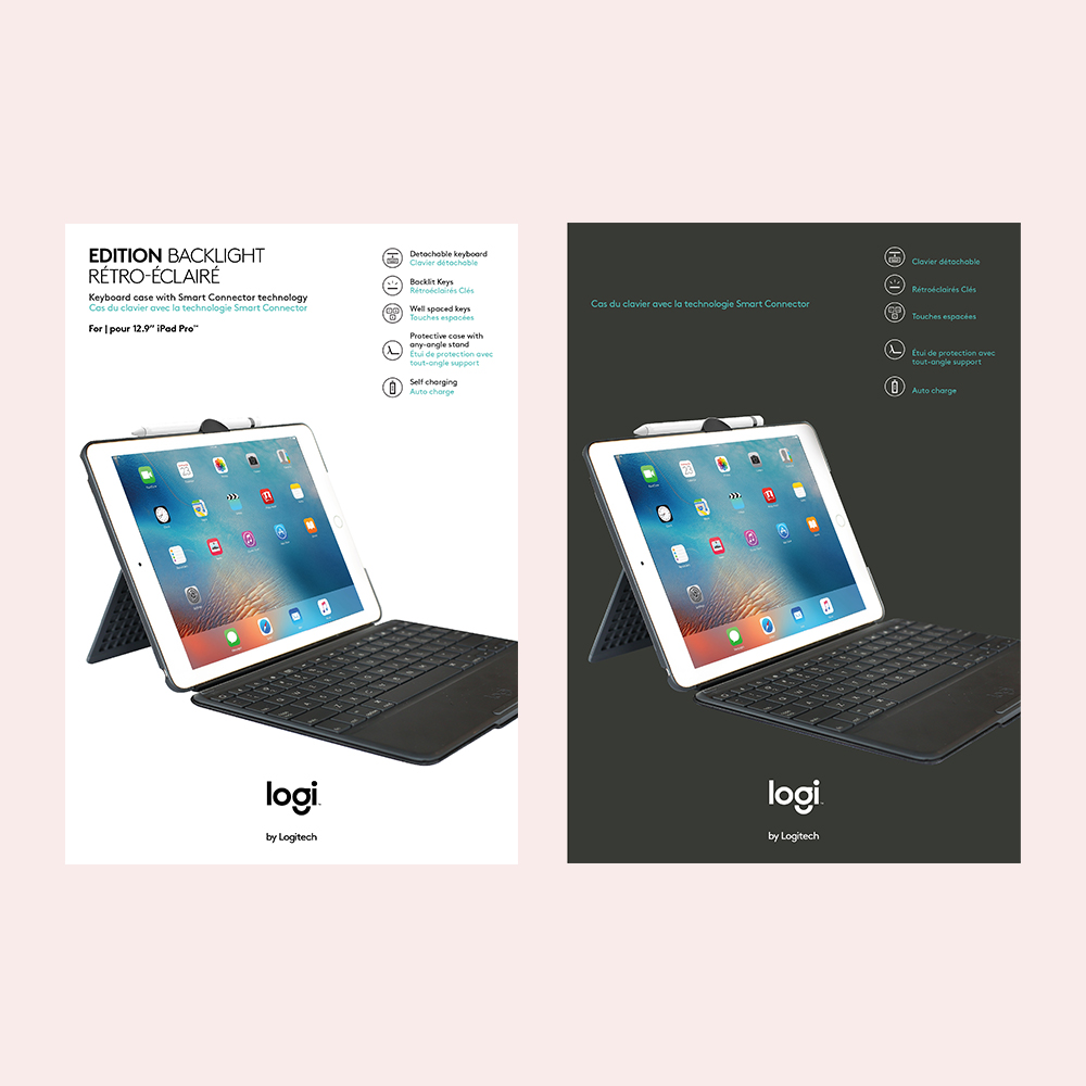 Tablet Case Packaging
 Vestcom Tag System
 Speaker C M F
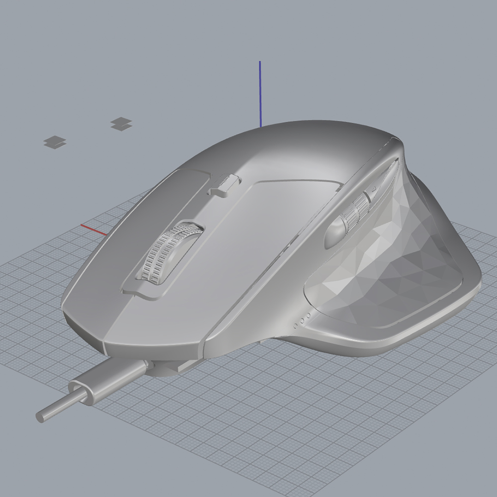 Flow Marketing Toolkit